We’ve all been told “don’t judge a book by it’s cover”, but what if it’s an album? Do cooler album covers inevitably make for a better album? This week, our music directors highlight some of the albums that they think have cool covers.
gary: …like clockwork by queens of the stone age
Queens of the Stone Age is a band that is highly accustomed to producing instantly recognizable artwork to accompany their albums. However, …Like Clockwork is a cut above the rest. Every element of the design works together in harmony to produce an image that stands alone from music of the album (which is similarly fantastic). The color scheme, consisting of only black, white, red, and splashes of blue, is expertly chosen to produce contrast and stark imagery. The characters at the center of the image are drawn in solely black and white linework, save for a stream of striking blue tears, which instantly draw the viewers attention and demonstrate the message of the piece. The band’s logo is also present and is drawn in the theme and colors of the overall cover. The entire canvas is backdropped in blood-red, which provides the piece with an uneasy, if not entirely evil, appearance. These design elements, as well as the appearance and features of the characters in the center of the canvas, combine to produce an image that is ubiquitously alluring, although for largely intangible reasons. Long before I listened to …Like Clockwork for the first time, I had already seen the album artwork spattered throughout the internet, on t-shirts, stickers, and just about anywhere else imaginable, which proves the attractiveness and significance of the cover.

ashlyn: mellon collie and the infinite sadness by the smashing pumpkins
Not only is this one of my favorite albums, but the album cover is just such a cool collage. Zooming in on any part of this image is exciting, and a personal favorite of mine is the cat head on the person standing on the moon. The artist, John Craig, used inspiration from Billy Corgan’s scribbled notes, and created an antique, surrealistic piece of work that we can all recognize alone from the girl coming out of a star. Staple album, amazing artwork, all around a masterpiece.

dayton: asleep in the bread aisle by asher roth
The main reason I picked this album cover is because it was recently used as inspiration for Barstool Wazzu’s latest merch drop. The album’s biggest hit I Love College was used as the main wording on the shirts and crewnecks, with butch laying on a beer pong table, imitating Asher in the bread aisle. I Love College was Asher Roth’s biggest hit, but the rest of the album is not to be slept on. His rap style is similar to eminem, but slower of course. He was also courteous enough to make a radio edit version of the album so I can play it on my show this week! At the end of the day, this album cover is cool as hell, and you should go check out the barstool I Love College merch!

isak: koi no yokan by deftones
The translation of Koi No Yokan in Japanese means “premonition of love,” in English. This album’s artwork really reflects well on the music you hear as you look at it. The picture was taken in Yayoi Kusama’s Infinity Room and it is just a really cool and trippy-looking album artwork that makes you think twice on how it was photographed.

zeke: congratulations by mgmt
For me, MGMT’s second studio album Congratulations is pretty underwhelming. I’ve listened to it several times now, but outside of a few singles I’ve struggled to really connect with the release. That being said, the cover art absolutely slaps. Created by legendary artist Anthony Ausgang, it features a disorienting display of pop art, patterns, and gradients. It was so eye-catching, in fact, that I bought a copy largely because of the cover alone. It’s hard to draw any deeper meaning from the work than “this looks cool,” but in my opinion it doesn’t need a deeper meaning to be effective.

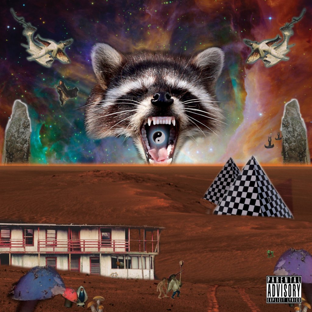
justin: off (ep) by trash panda
This cover is probably one of my recent favorites, and the band name is just as fun. A screaming raccoon with a yin-yang symbol in its mouth and a collection of random geometric shapes highlight the cover. The music isn’t half bad either.
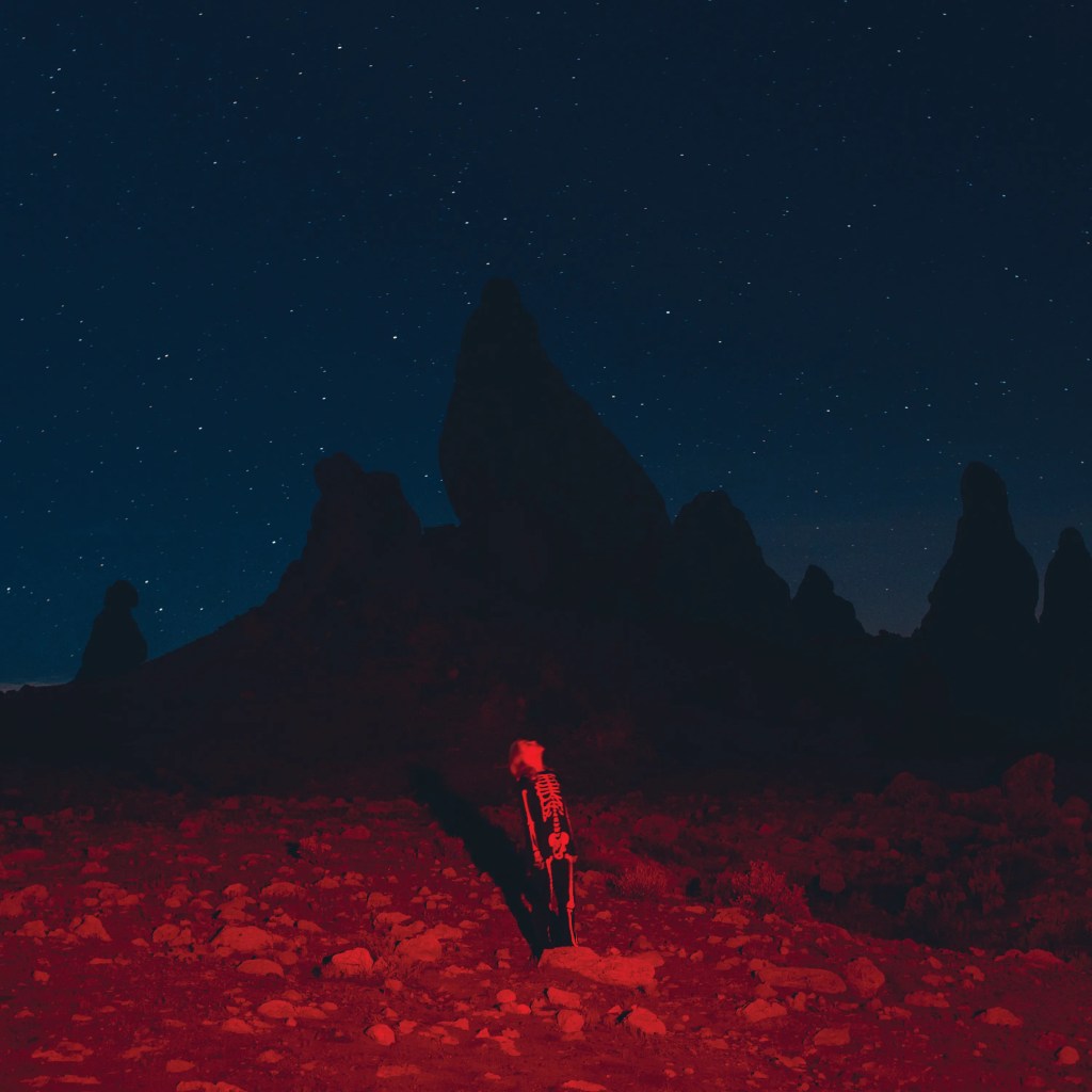
petar: punisher by pheobe bridgers
This album cover perfectly encapsulates the atmosphere and mood that Phoebe delivers on this album. Although there’s a beautiful contrast of vibrant reds and blues, the image still feels desolate which is a perfect metaphor for Punisher. The artist behind this cover is Swedish photographer Olof Grind who is one of my favorite photographers. Olof’s work focuses on people’s individual relationships with nature which is clear on this album cover. When I see this album’s cover I feel the same feeling that the music gives me. Like the cover, this album radiates feelings of despair, melancholy, anger, regret, and a hint of hope. For those who’ve never listened to Phoebe Bridgers, I recommend the song Savior Complex. Additionally, to all the photographers out there, I recommend checking out Olof’s work as well.
CADEN: MORE SEX LESS VIOLENCE BY CHARLES BOYD
Charles Boyd ❤